Revitalising an iconic beer brand
Tetley’s is one of Britain’s best selling ales. The brand and packaging needed reinvigorating to realign the brand with its core customer base, whilst making it relevant for today’s drinkers.
The Huntsman had served Tetley’s well for nearly 100 years, however, we identified that a change of symbol would be key to creating a symbol of change for the brand.
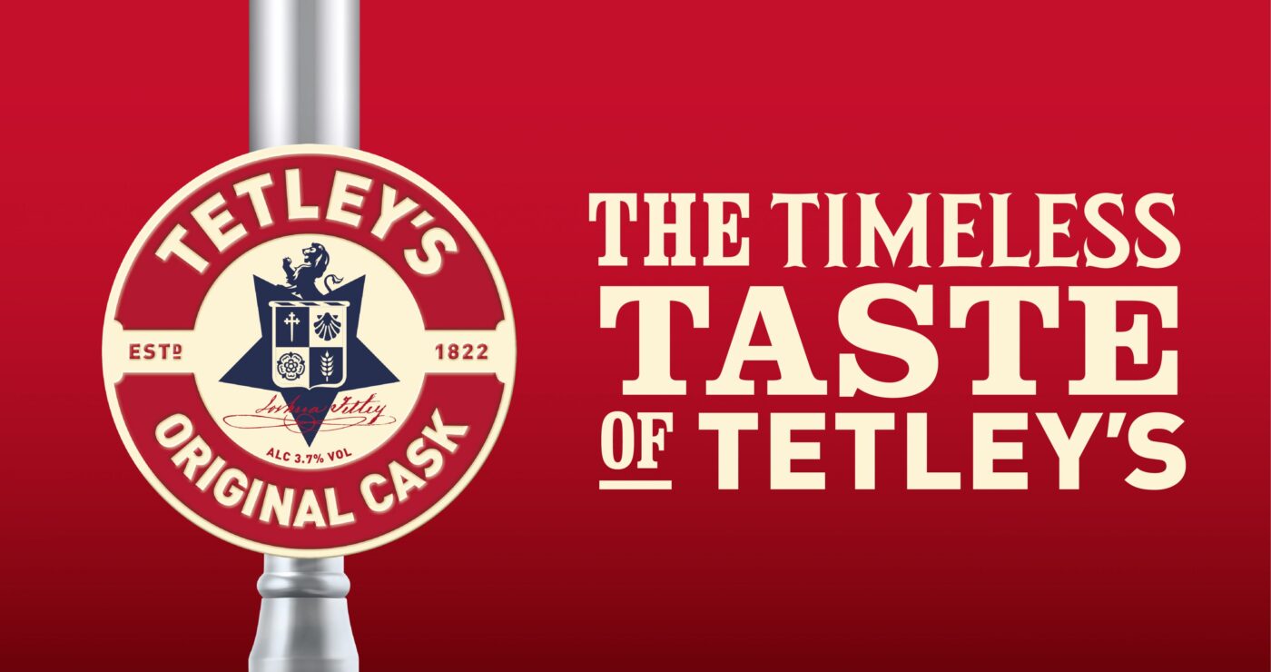
Tetley’s Cask, the flagship brand, was totally redesigned with an embossed metal pump clip that positions the ale as premium.
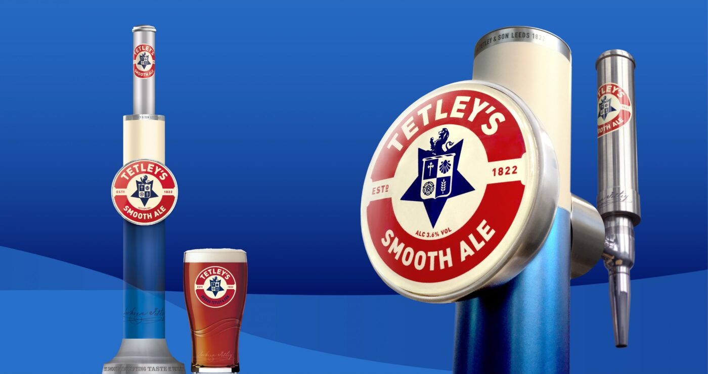
We revived Tetley’s refreshing beers for the on-trade.
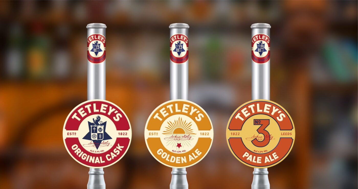
We also introduced NPD for Tetley’s, based on their original recipe.
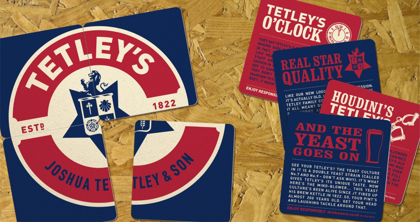
The symbols in the new logo, derived from the original coat of arms, are inspired by the Tetley family’s previous business as Maltsters
WPA Pinfold have been a key partner for Tetley’s over many years and their balance of in-depth knowledge on the brand’s history, as well as future thinking, is what makes them stand out from the crowd. WPA’s work oozes quality and pride. Their attention to detail all the way from project concept to end deliverables is the icing on the cake. Their understanding and sheer love of beer is the cherry on top!
+7% Increase in On-trade volume
Winner Silver Design Effectiveness Award
+5.2% Rate of Sale (ROS), This equates to 319 more pints per outlet per year.

