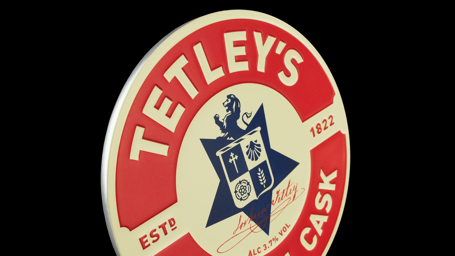
Rebirth of a family brewing brand
Having designed the Thwaites Group brand over ten years ago, we were asked to reassess and reposition the brewery brand to coincide with its move from its large 1960’s site to a smaller, craft sized brewery just outside Blackburn. This move represents a fresh start and a focus on the more profitable side of the business, with the beers being brewed exclusively for Thwaites’ own estate.
The challenge was to create a unique positioning for the brand, to support the new strategic direction of the company and also differentiate the beers from an increasingly crowded and busy beer landscape, where ephemeral graphics predominate.
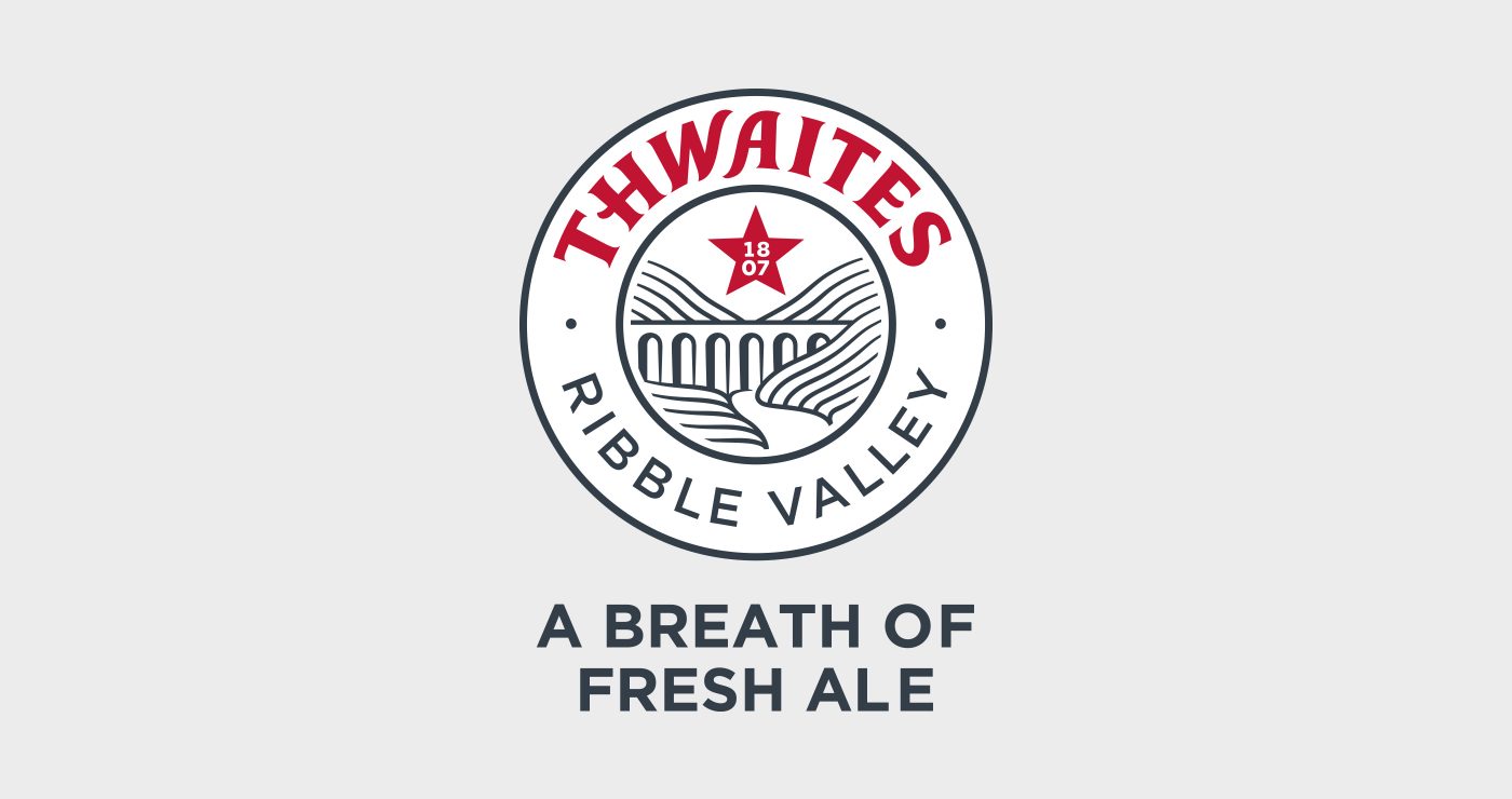
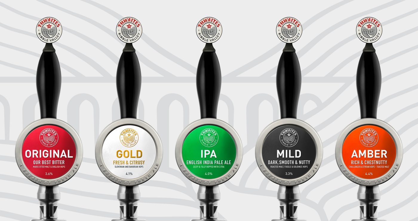
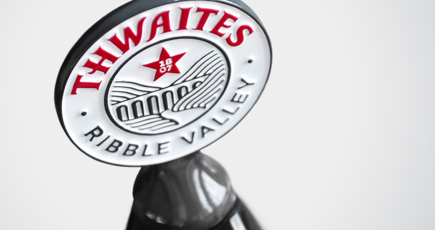
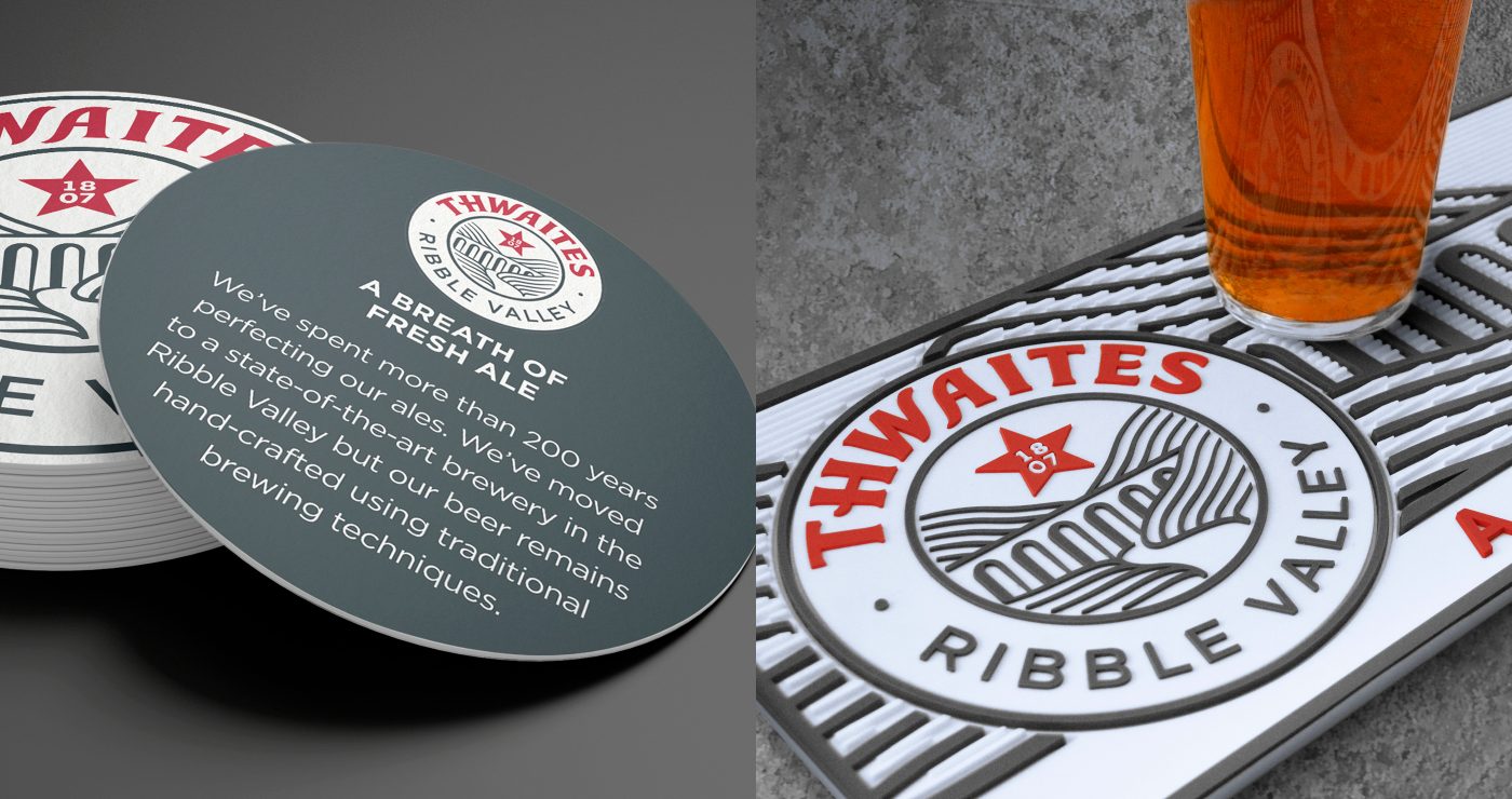
After undertaking a strategic review, that assessed Thwaites’ future proposition and positioning, we took the decision to use the brewery’s beautiful new location, at the heart of the Ribble Valley, as inspiration for the new brand. We also repurposed our previous logo (as part of the new brand) to retain equity with the breweries existing customers.
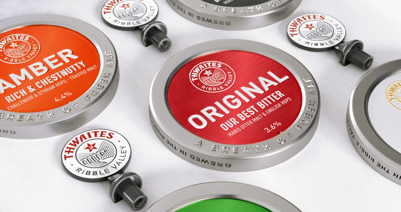
The brand communication is simplified, with a focus on the new brand and the individual styles of beer. Whilst the materials and finishes emphasise the added value and no-nonsense quality that Thwaites is all about – the pump clips and branded finials form the centrepiece of the bars, to help make them unique and special.
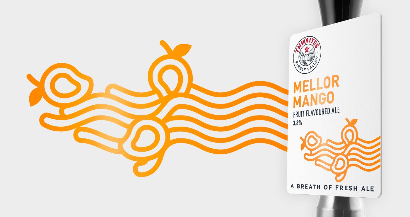
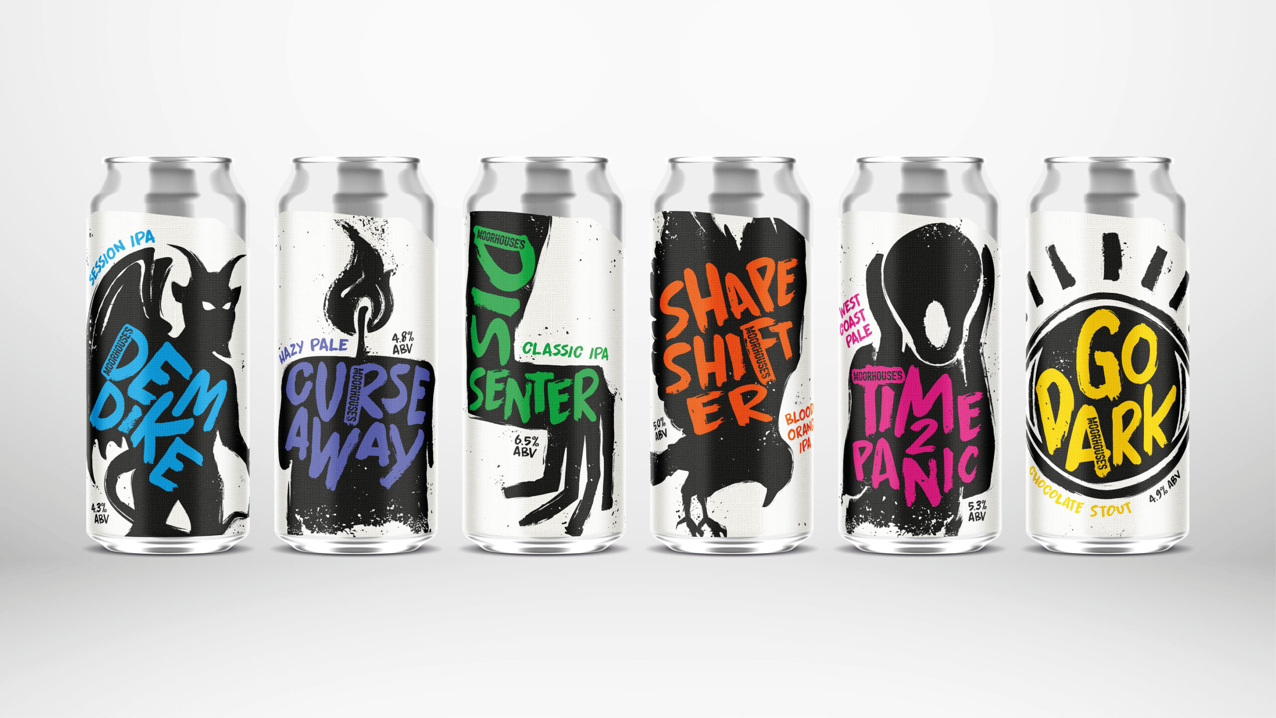
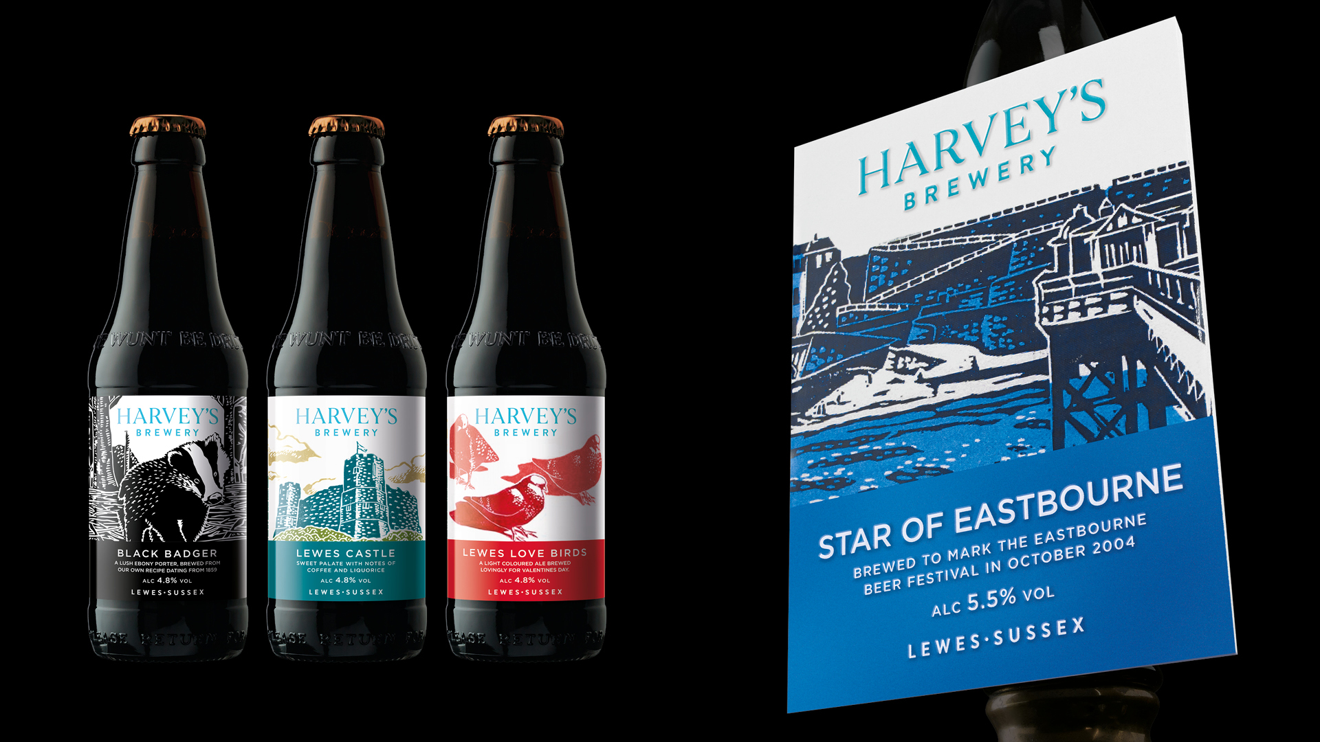
The illustrative brand style is expanded for POS and has also been developed onto other packaging formats. For example, the seasonal beers are inspired by local geographic names and use abstract illustrations based on the core brand style to create freshness and a unique, ownable brand look.
The new brand has re-energised both the company and everyone connected with Thwaites, and has given a new direction to the business by focusing on quality and added value.
Feedback has been fantastic, and everyone is loving both the look and taste of the beers!
Thwaites