T&R Theakston
Re-positioning an iconic brand to create growth
Challenge
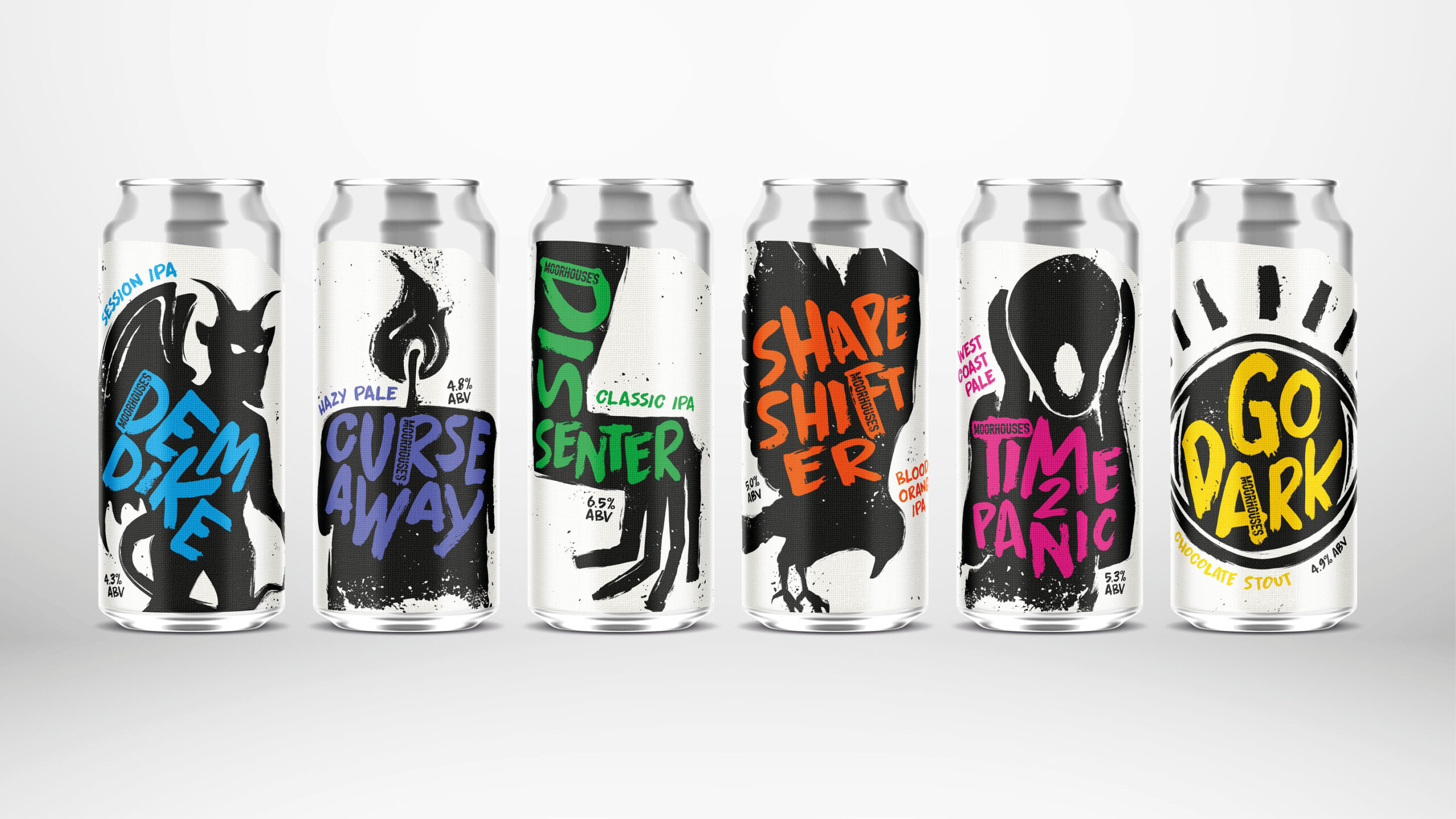
Theakston had gone through a roller coaster of a business journey, including the highs of regaining family ownership and being recognised as a truly independent brewer and champion of English ales. Theakston already had brand equity with its core, more traditional drinkers, however a new category had been created - craft beer - and it was dominating the market. The sector became flooded with new brewers and brands, all competing for the same space on bar and on shelf. Moreover, Theakston did not want to be seen as ‘dad dancing’.
Insight
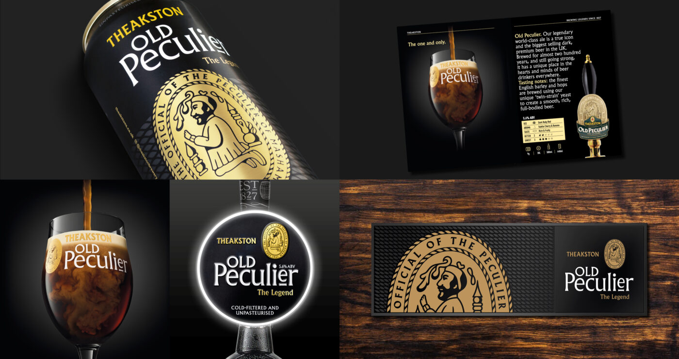
The origin of the Peculier name is an interesting story. Theakston’s brand symbol is based on the seal of ‘The Official of the Peculier of Masham’ which dates back to Medieval times when the owner of the lands and estates of Mashamshire (Roger de Mowbray) donated the living of the church at Masham to the church of St Peter in York. This eventually resulted in ‘The Court of the Official of Masham’ being set up with the ‘Peculier Official’ as its administrator and the seal as his stamp of authority. Several centuries later the local church granted Theakston Brewery (as an integral part of Masham and community life) permission to use the seal as part of the company’s livery.
Brand design solution
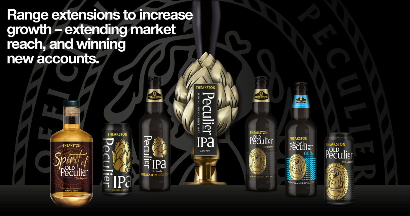
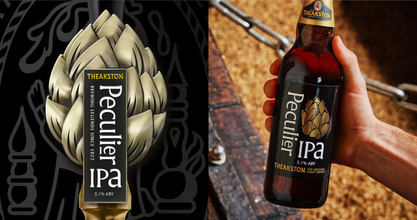
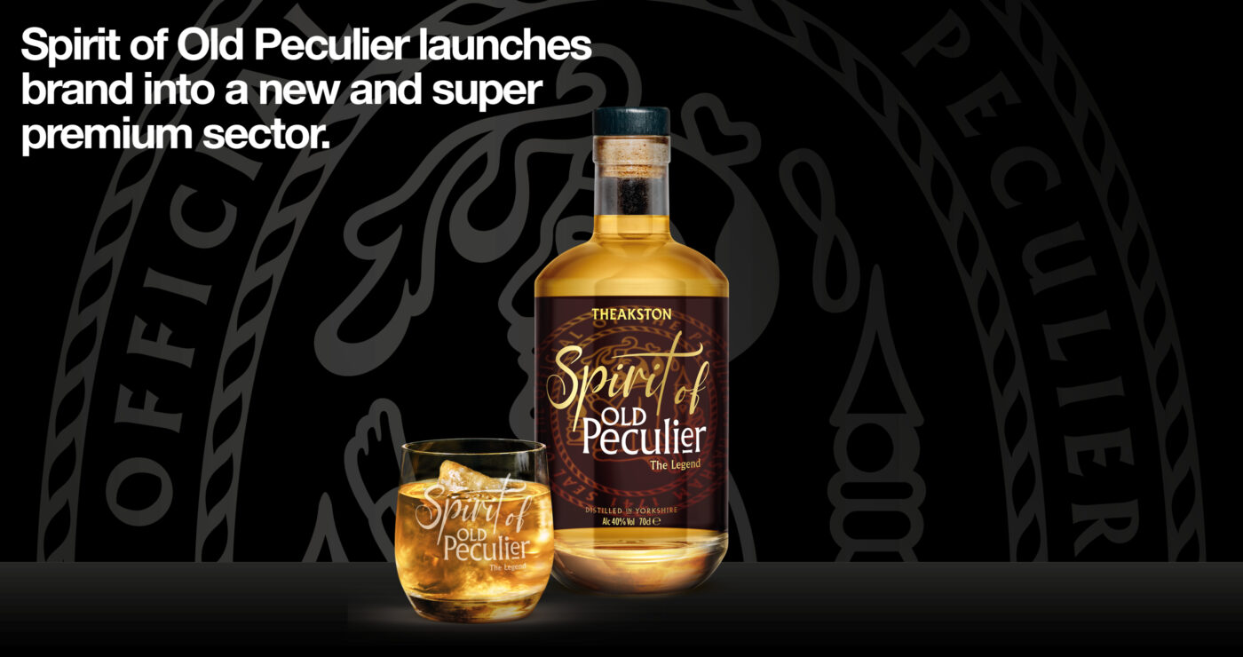
Theakston had spent almost two centuries building its reputation and developing a strong market following as a brewer of authentic and traditional ales of exceptional quality. The range extensions and brand design solutions were a careful balancing act – they had to build on Old Peculier’s brand integrity and equity whilst also being both contemporary and premium – appealing to both the new wave craft drinkers and the beer traditionalists. We worked on the brand hierarchy to ensure that the name Peculier was hero and the brand colours were consistently applied, especially the gold. The typography was carefully developed in the Peculier style.
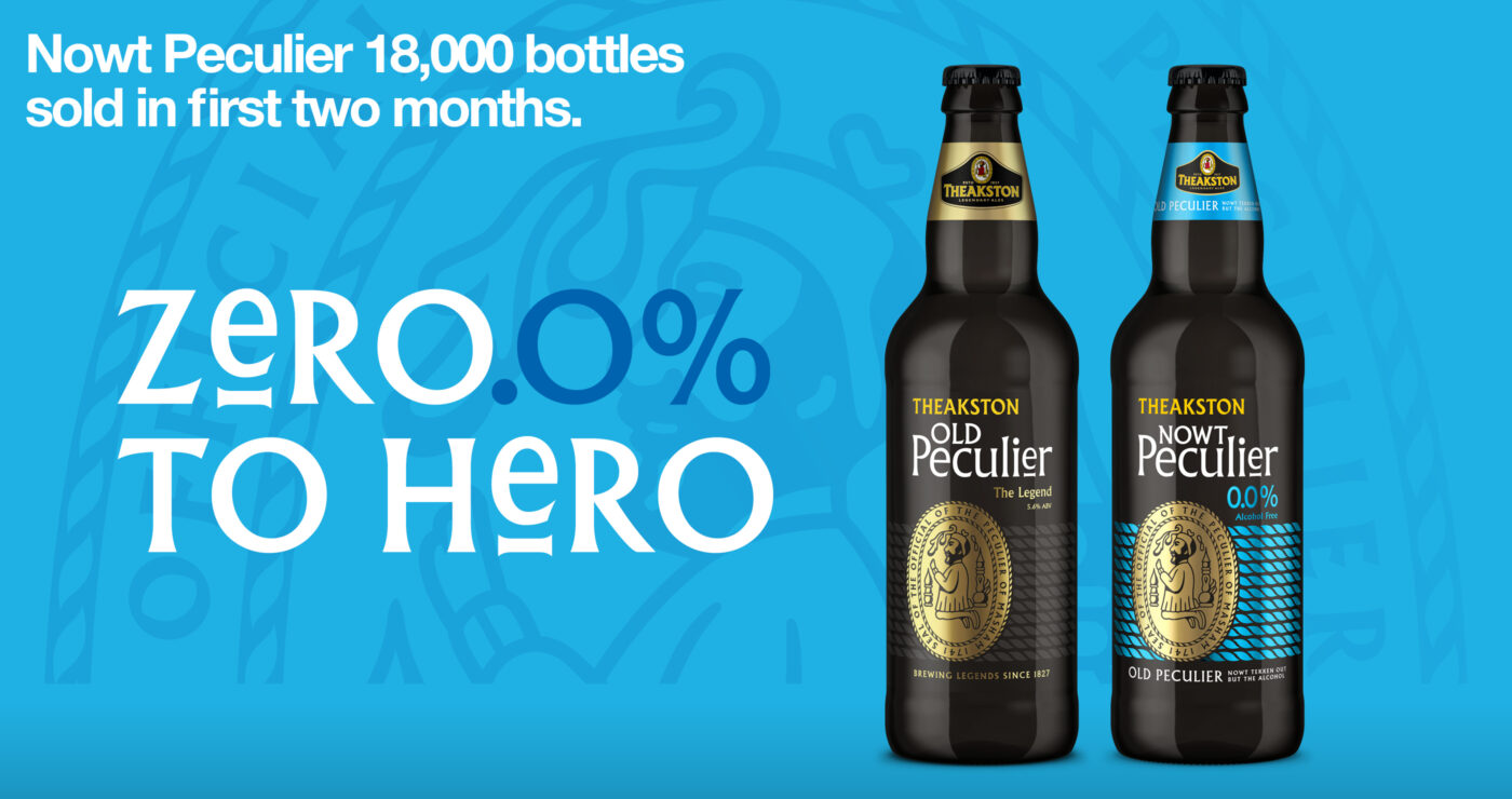
75,000 Bottles of Nowt Peculier sold in seven months since launch in 2024.
+100,000 Peculier IPA bottles sold per annum in the off-trade alone since launch in 2023.
New Peculier IPA new national accounts already won since launch in 2025. These include: Morrisons; Coop; Booths; Heineken; Star Pubs; Stonegate; JD Wetherspoons and major wholesalers.