
Equinox X T&R Theakston
Brand design delivers hoptimum refreshment
Challenge
The challenge was to build on the hop forward credentials and proper beer-like refreshment of craft beer and position Hopbucha as the healthy, refreshing adult soft drink alternative.
Insight
More people than ever are rethinking their relationship with alcohol. Low and no-alcohol beer sales are rising fast, driven by a generation that wants to socialise smarter — without compromising on taste, craft, or wellbeing. At the same time, there’s a wider demand for probiotics, rich alternatives to conventional soft drinks - the UK Kombucha market is growing annually by +20%.
Brand design solution
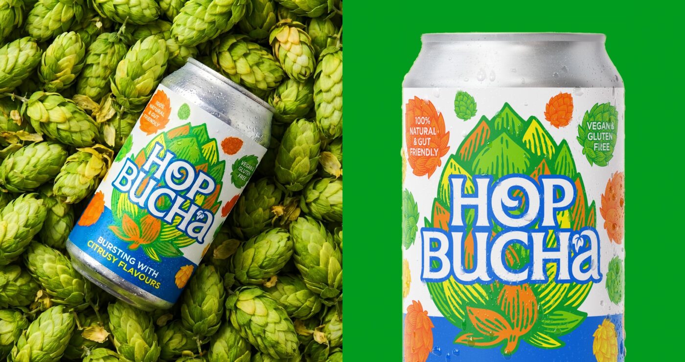
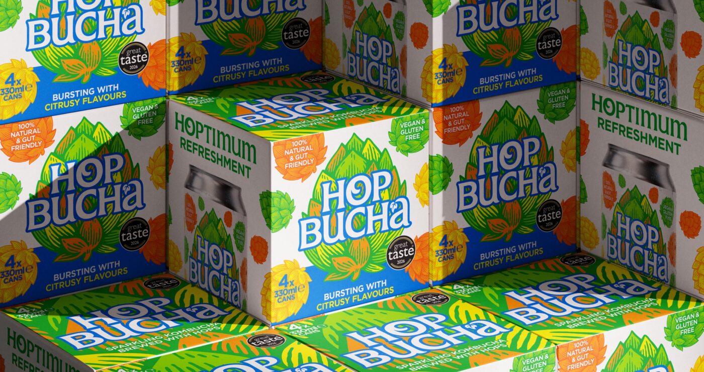
The brand design is built around the iconic hop symbol that is recognised across the beer sector, whist the vibrant colours represent the fruity flavour cues imparted by the hop varieties. The Hopbucha logo has been hand drawn to make it uniquely recognisable and create maximum on-shelf impact. The exploding hop pattern implies ‘bursting with refreshment’.
A refreshing new brand identity
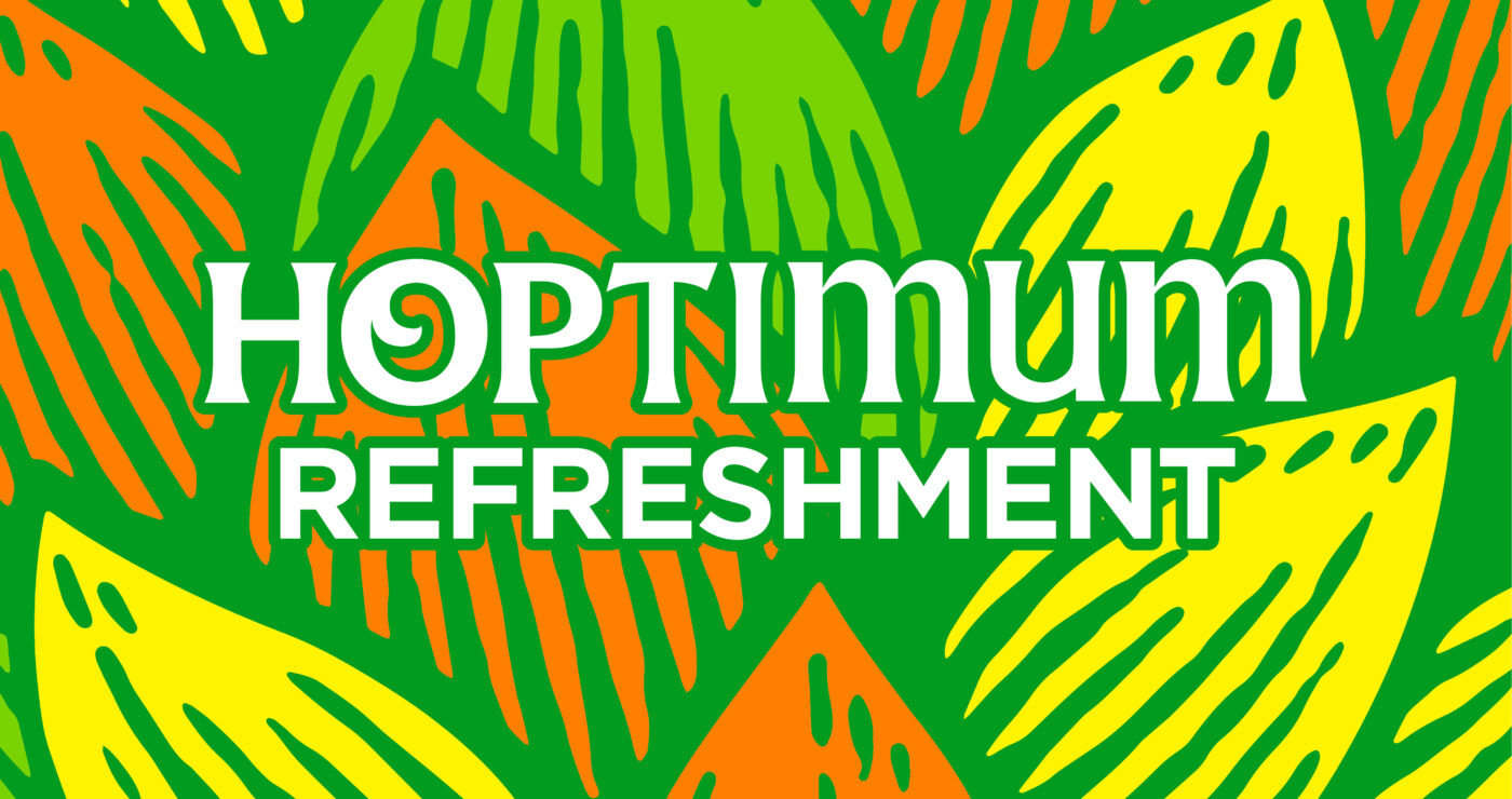
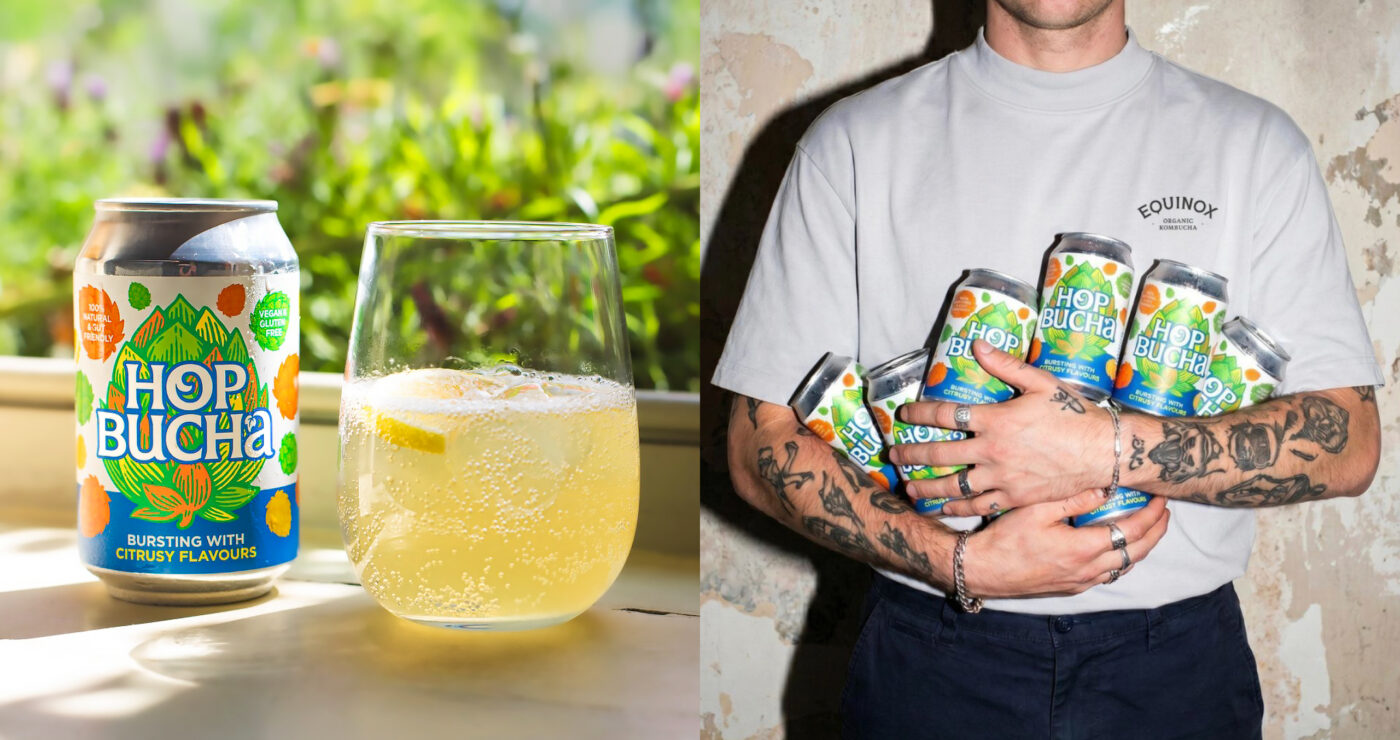
Born from a bold Yorkshire collaboration between Equinox Kombucha and Theakston Brewery, Hopbucha blends craft hops with raw kombucha fermentation, truly putting the hop into pop! Built around the idea of Hoptimum Refreshment, the brand design draws inspiration from the fruity hop flavours, utilising a contemporary eyecatching colour palette to give the brand some pop!
Bursting with brand impact
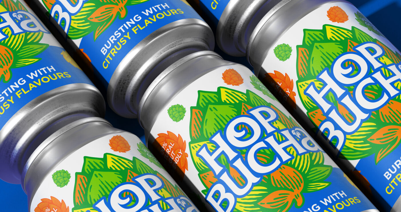
The refreshing new brand design features an explosion of hops that captures how bursting with flavour this kombucha is.
We have for many years entrusted the design brief of our company's brands to WPA Pinfold. Their work is consistently outstanding and has helped propel success of our beers throughout the UK and overseas
T&R Theakston

