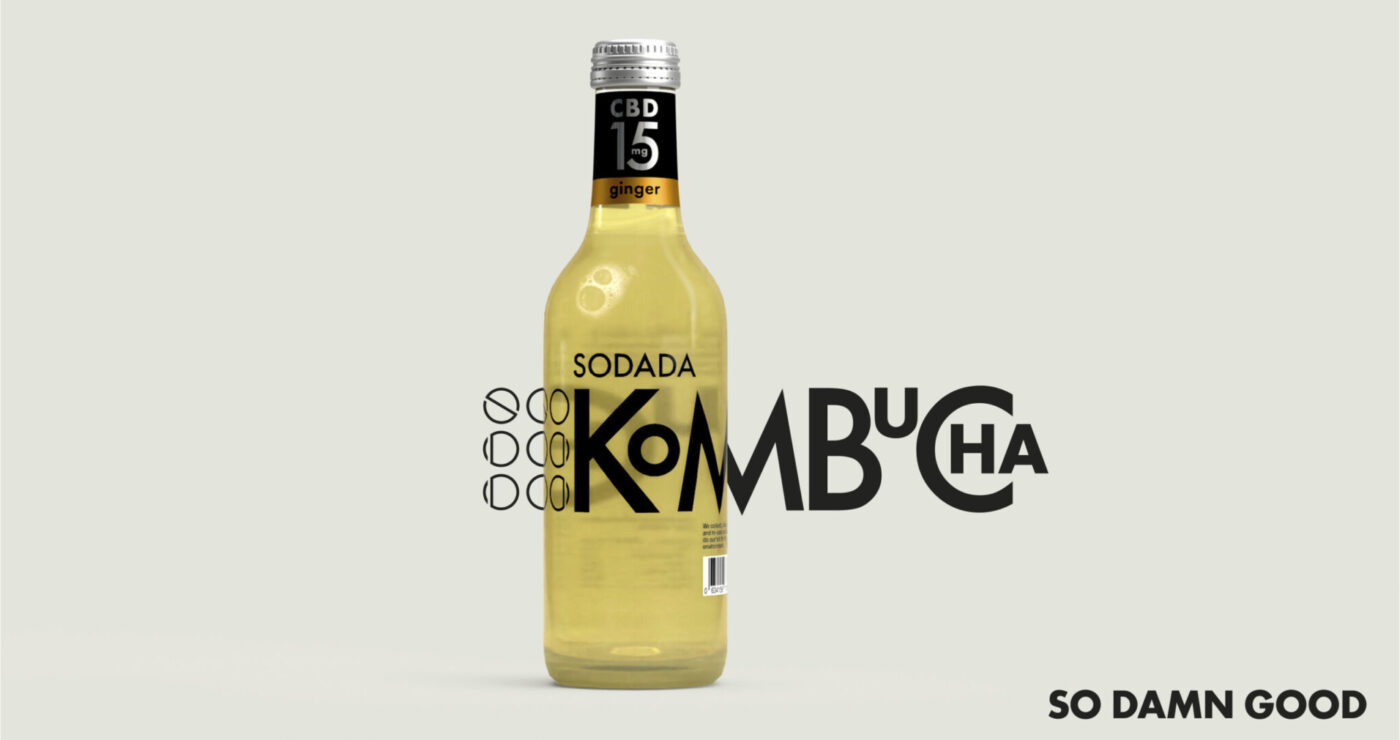
So damn good, Kombucha!
SODADA came about out of a desire to disrupt the soft drinks sector and give consumers an alternative, healthy drink that is full of goodness. The new brand had to deliver true differentiation.
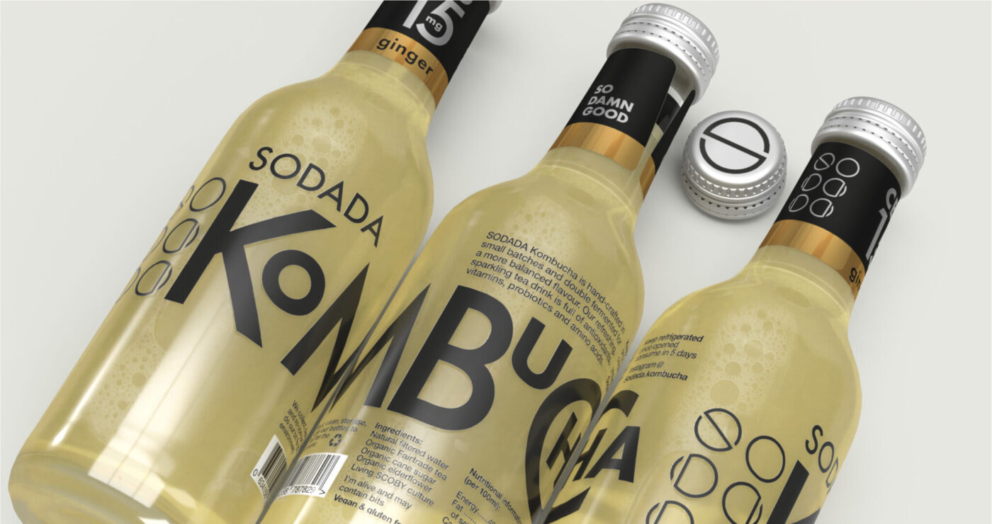
We created the name as a portmanteau by blending SODA with DADA – the disruptive art movement that inspired the logo and typography.
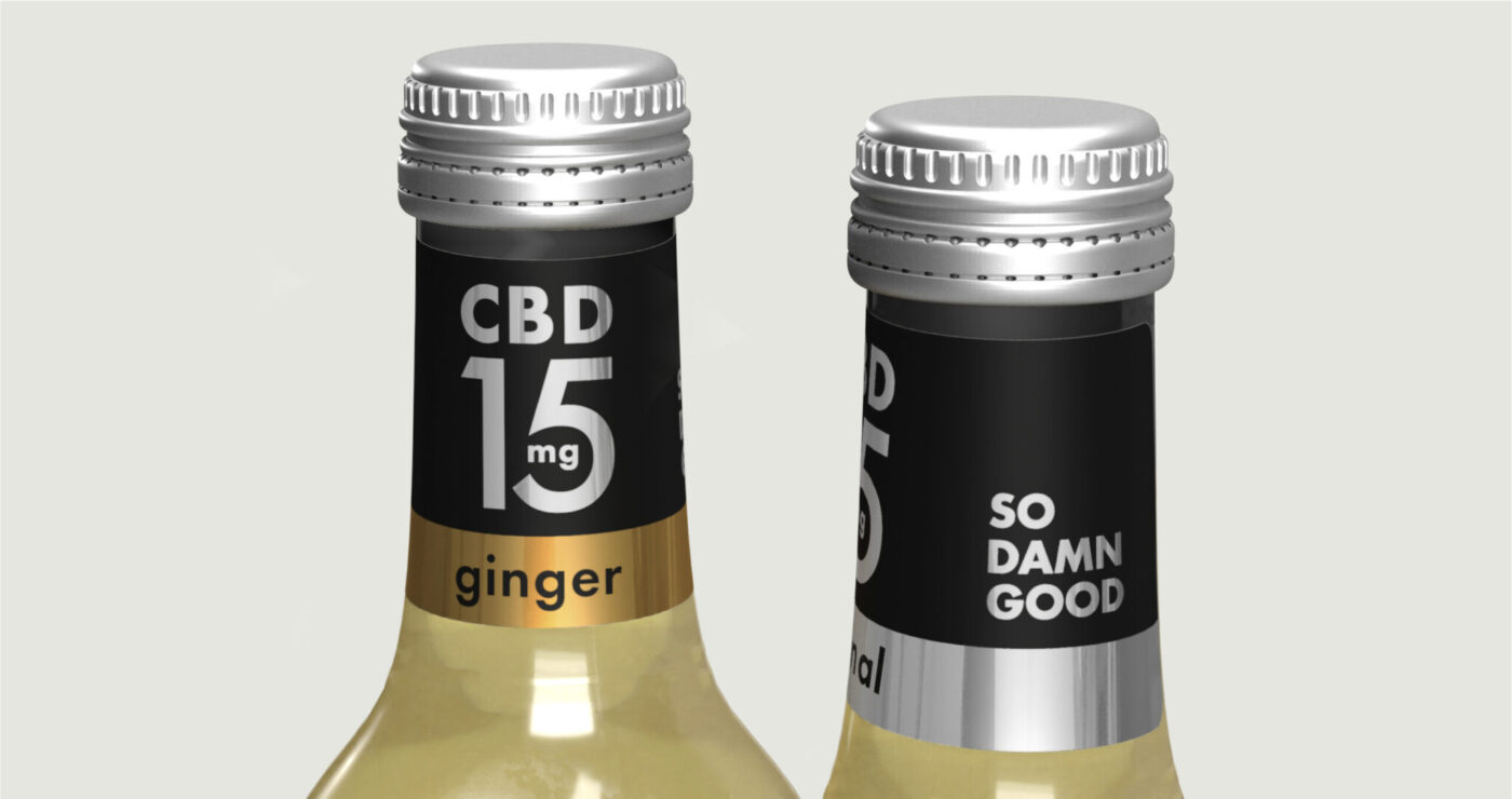
Premiumisation was key, however the normal added value design and production conventions were not relevant to the target consumer who is concerned about sustainability and shuns over-packaging.
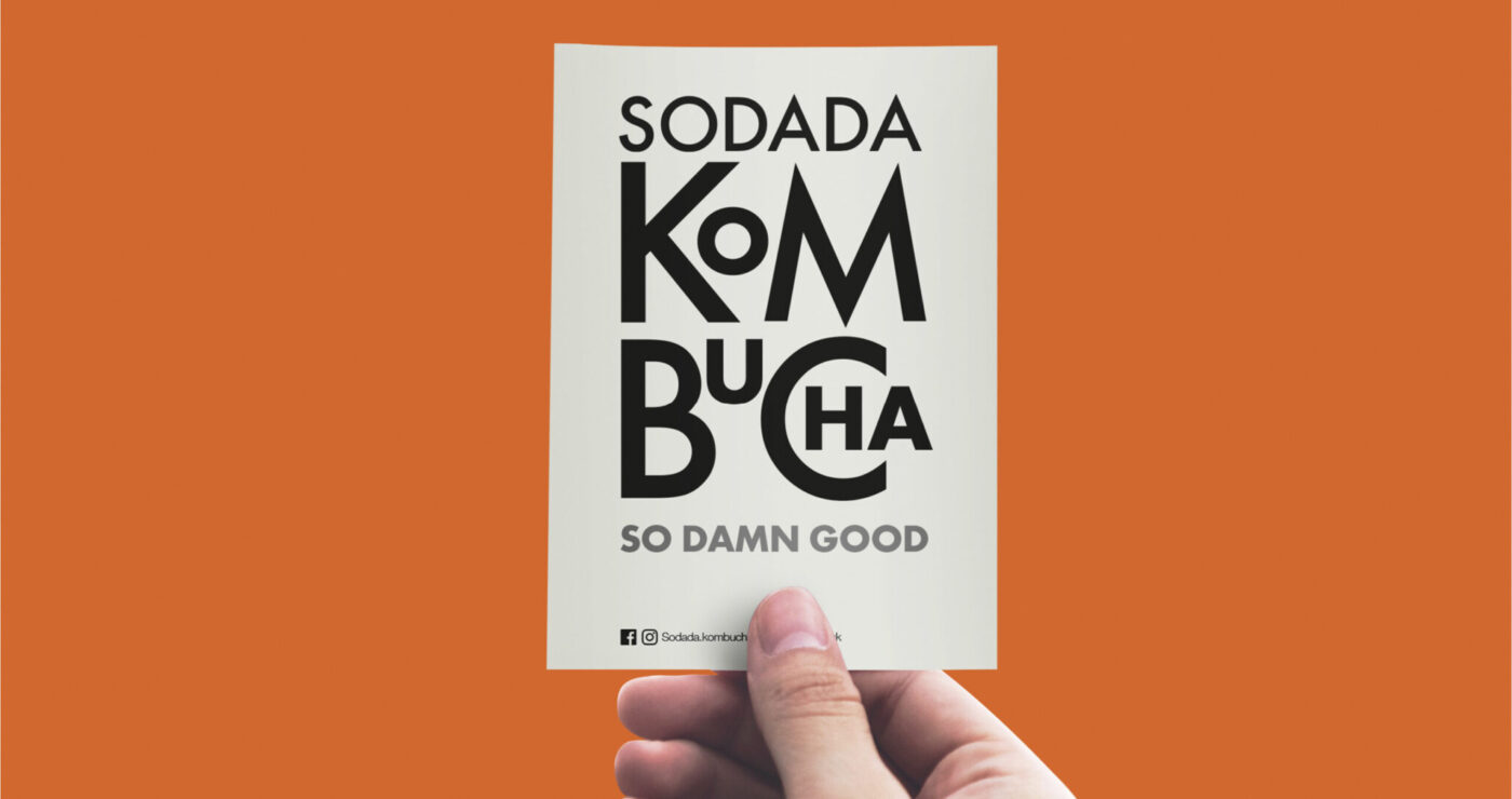
The strategy was to ‘own’ the category by making the product descriptor (Kombucha) a key part of the brand delivery, with its unique and quirky typography.
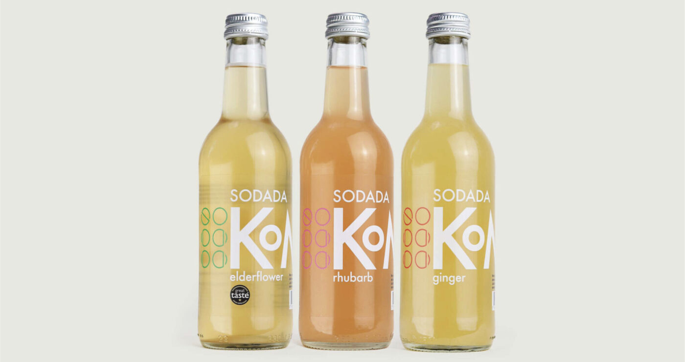
New products were developed to tap into the new health trends and keep the brand relevant.
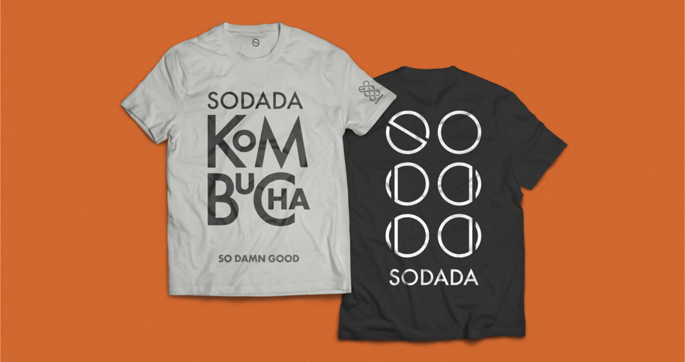
The true test of any brand is whether it adds value to merchandise.
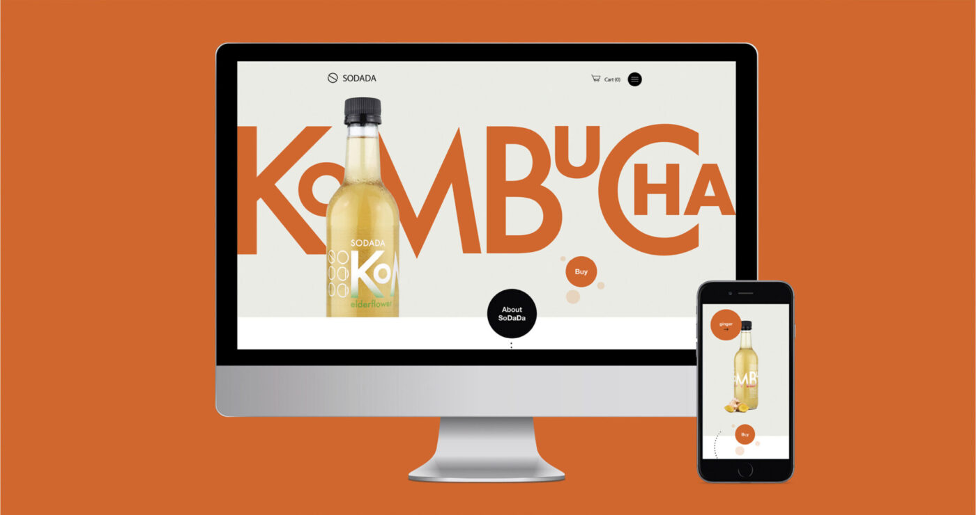
Online presence has driven growth through engaging social campaigns and website.
Our SODADA brand identity is outstanding. It has enabled us to punch above our weight and given us real credibility. Leading with ‘kombucha’ as a logo on the packaging has given us a real edge and helped us beat the competition in this specialist and innovative sector.